26 Jul The Psychology of Red: How Mandrill Monkeys Pioneered Data Visualization

The Psychology of Red: How Mandrill Monkeys Pioneered Data Visualization
Visual reaction time is the time required to respond to visual stimuli. Scientists have studied visual reaction time for many years, particularly in response to color stimuli. These studies consistently demonstrate a faster reaction time to green and red – as compared to yellow. This is not surprising, given our environmental conditioning to traffic lights, brake lights, technology warning indicator systems…etc.
But, let’s focus on red. Red is undoubtedly the most psychologically influential color. What other color can cause a person to slam their car brakes so forcefully that the $7 triple, venti, soy, no-foam, 2-pump-vanilla gem held lovingly in their hands splatters to its premature death in a blink? Behold the power of red. This manipulative color’s ability to influence behavior can be traced back to our primate ancestors.
Primates, unlike most mammals, have retinas that can differentiate between red and green. This trait presumably evolved to better identify edible fruits – which are typically red in color. But the ability of primates to differentiate color is profoundly more complex than helping them find fruit. The evolution of this trait afforded our primate ancestors, such as the Mandrill monkeys, rapid visual reaction time to color as an indicator of dominance. Vibrant red markings (as opposed to blue) are found on the skin of the larger, more physically fit and aggressive males with higher testosterone levels. Thus, lower-ranking monkeys instantly react to the red color and avoid a battle they will likely lose.
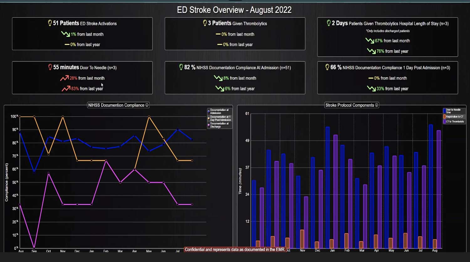
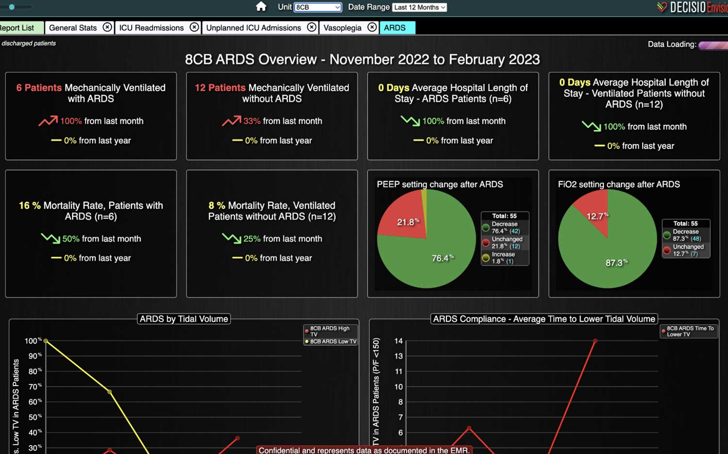
The skin color is a visual display of the underlying “data points” listed above (i.e. physical fitness, testosterone level…etc.) Call me crazy, but the Mandrill monkeys could be the pioneers of data visualization. After all, data visualization describes any effort to facilitate interpretation of data by placing it in a visual context. Data patterns, trends and correlations that might otherwise go undetected are exposed and recognized easier with data visualization.
The Mandrills, in this use-case, care only about a handful of data points pertaining to male dominance rankings. But shift gears to their human counterparts, living in an era of “data gluttony,” and the challenges of simplifying data visualization for rapid end-user reaction time become obvious. In other words, in every industry, figuring out what data to pour into the top of the data funnel and what data to titrate out for optimized visualization is no easy feat.
For industries like healthcare, where every second counts, the pressure to simplify the visual display of data for rapid interpretation by nurses and physicians is even more intense. So, where do we start? Maybe we learn from our sage primate pals, and start with the basics – like color.
Red is bad. Very red is worse.
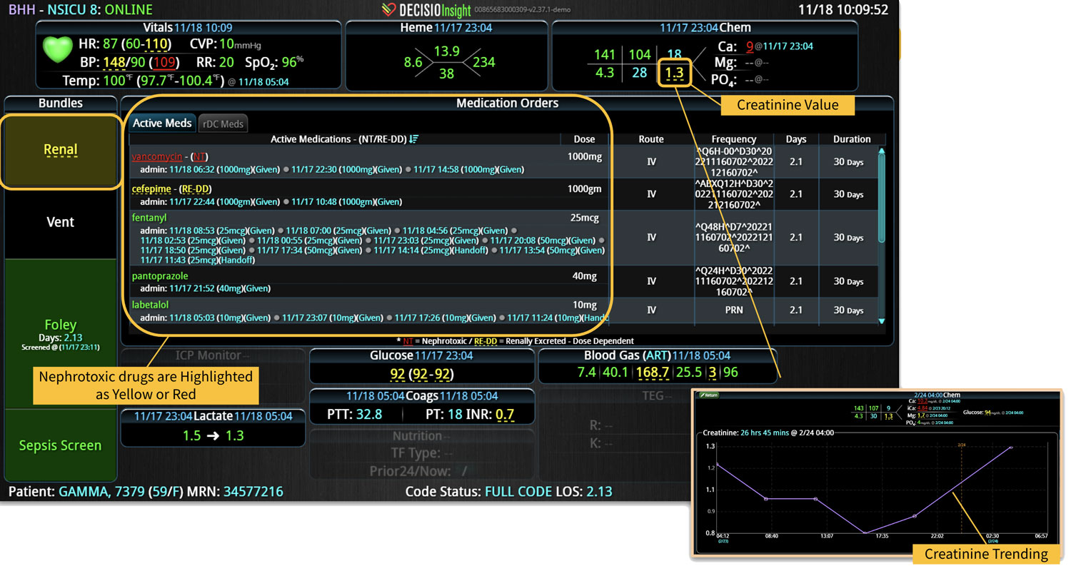
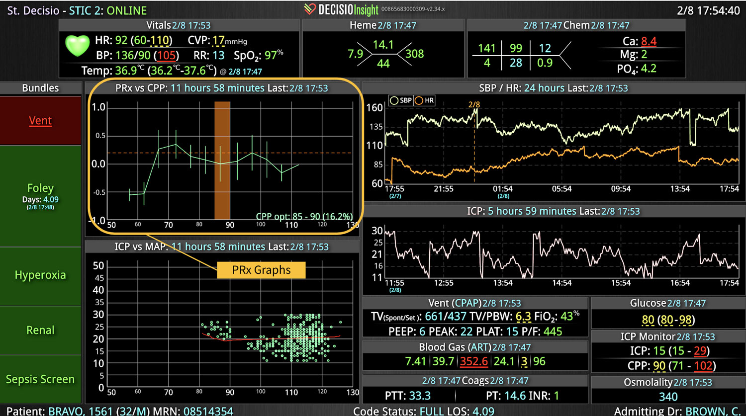
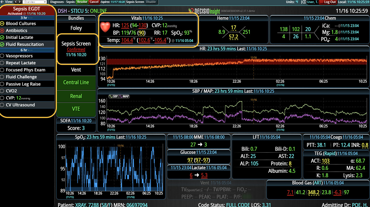
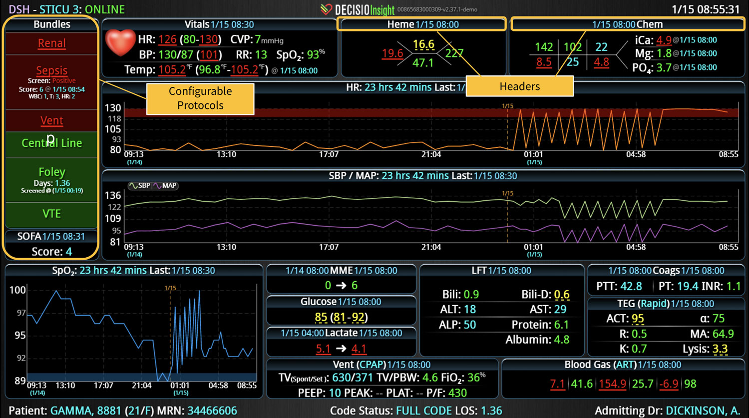
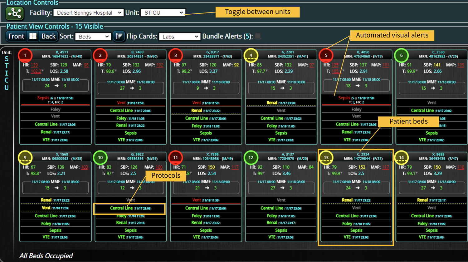
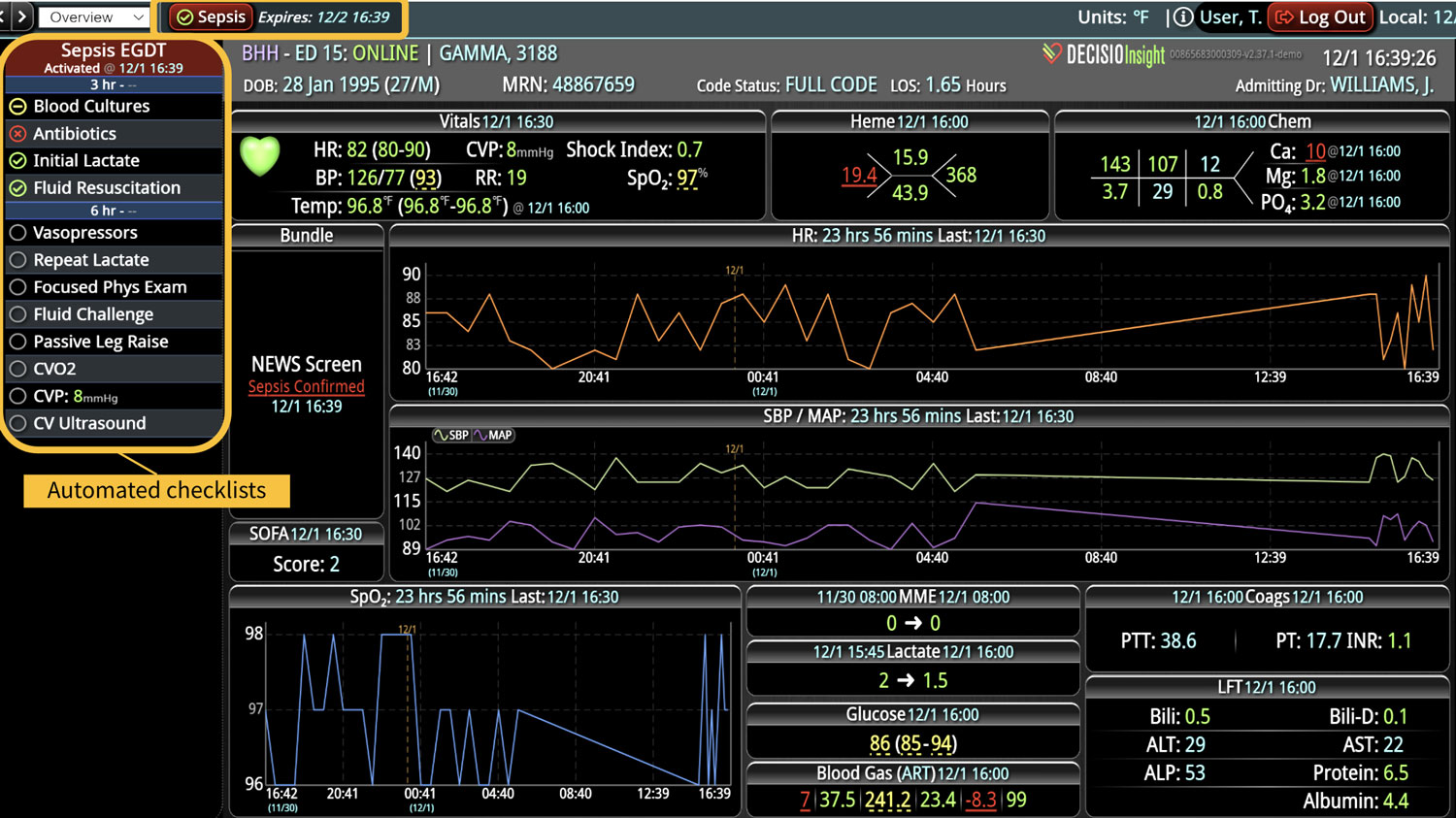
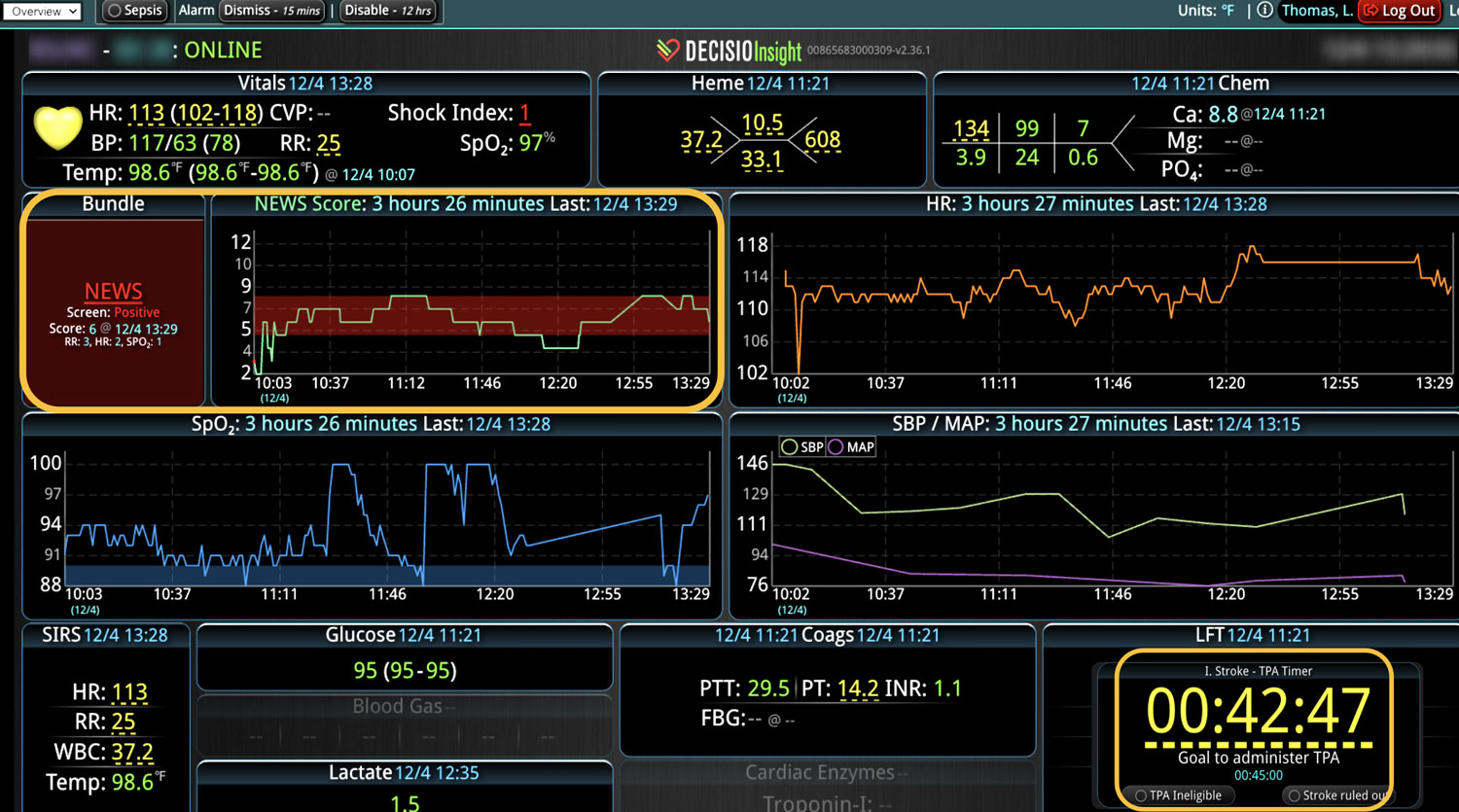
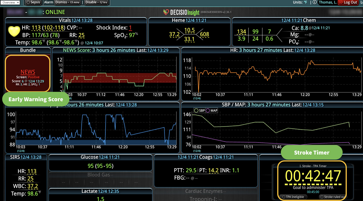
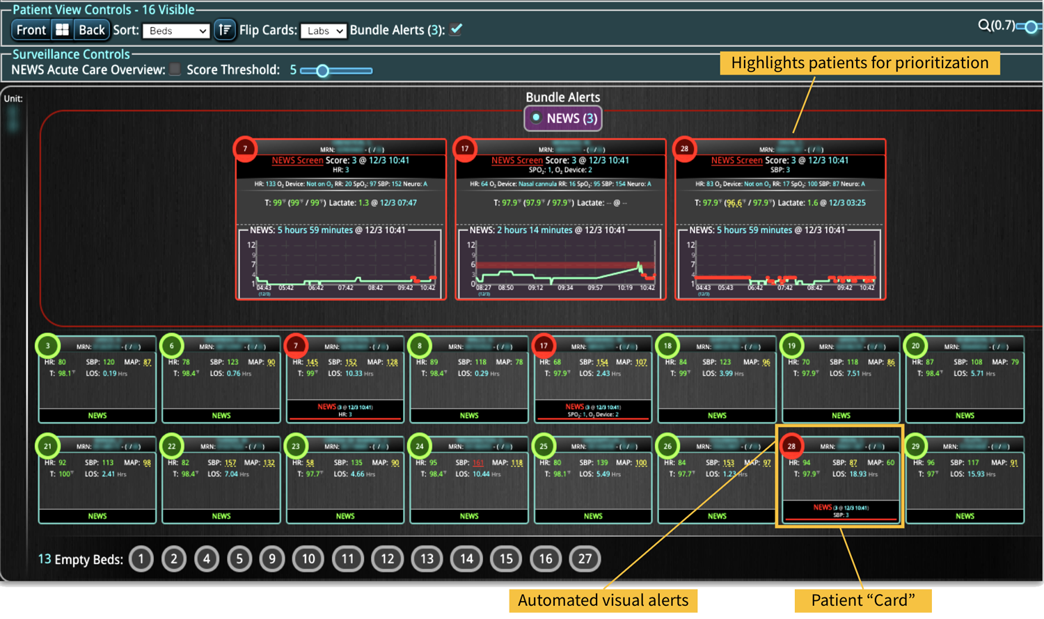
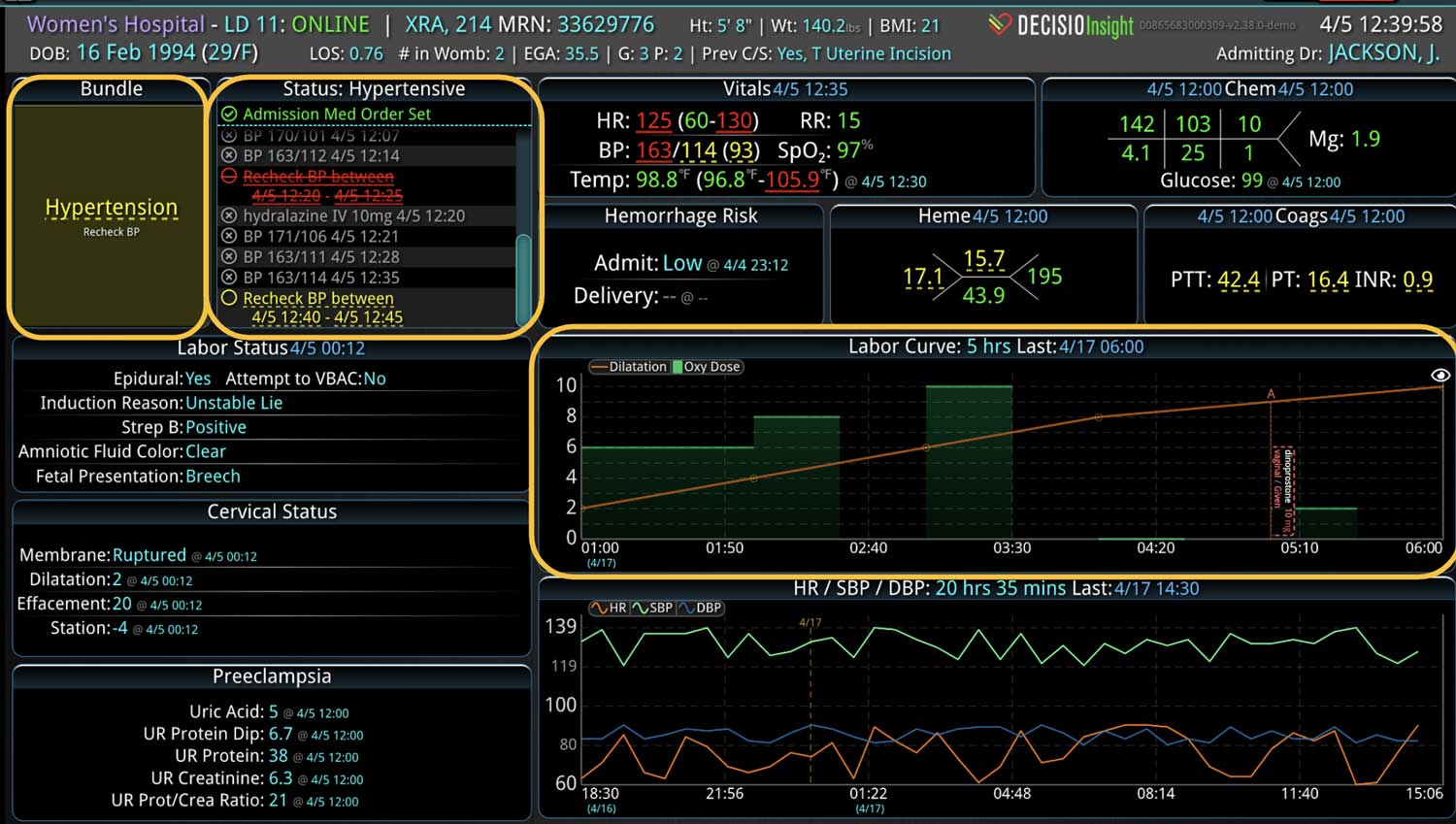
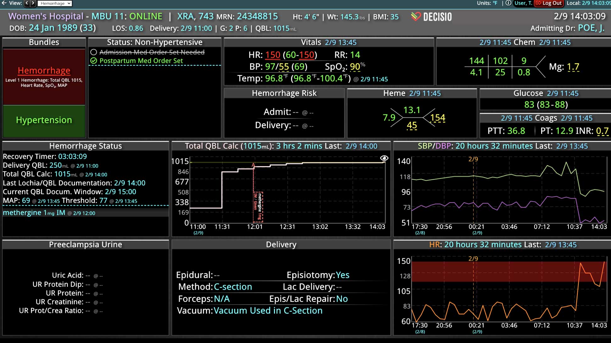
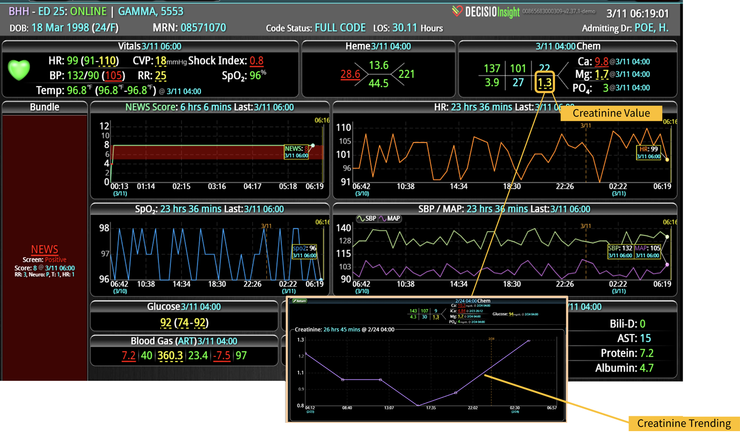
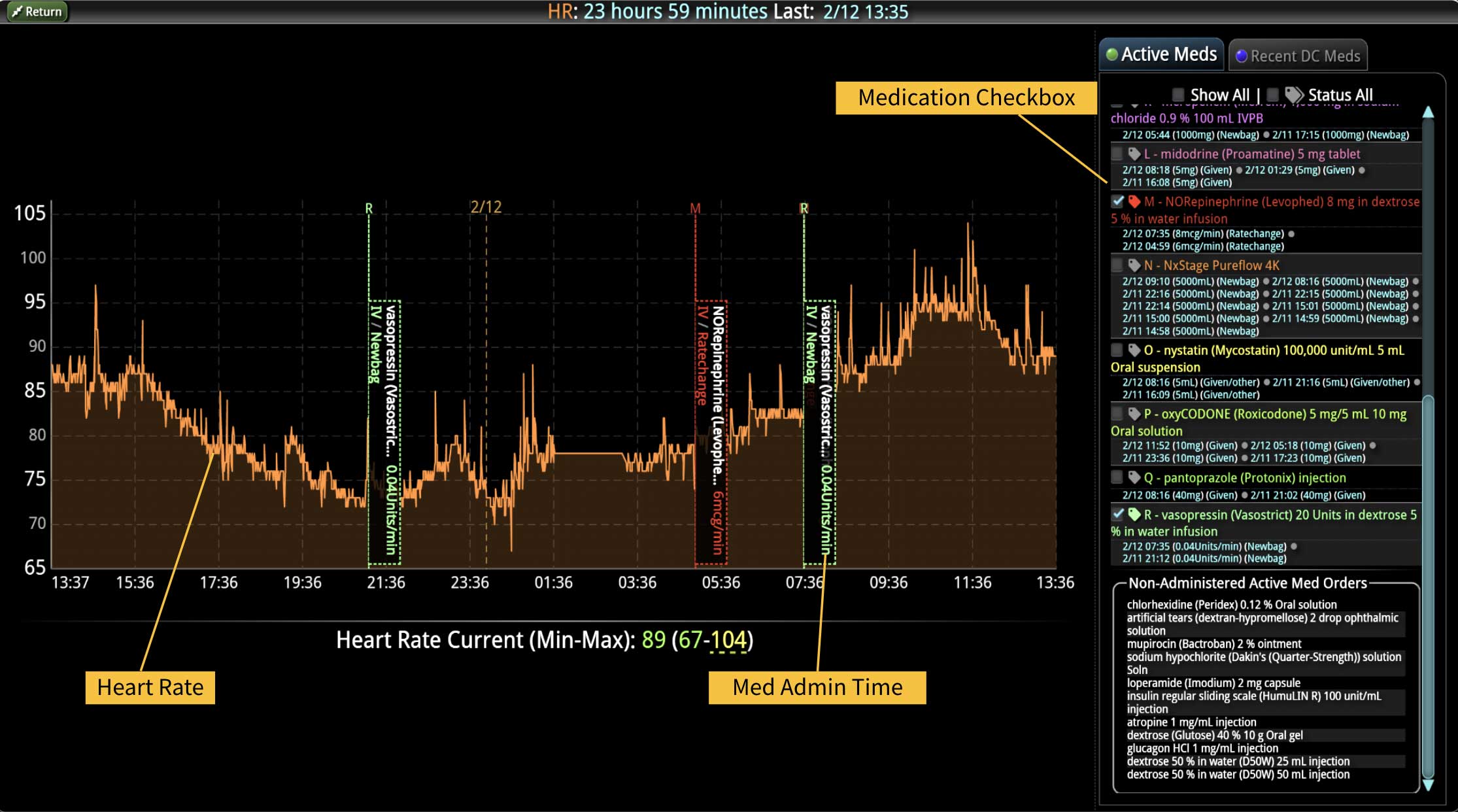
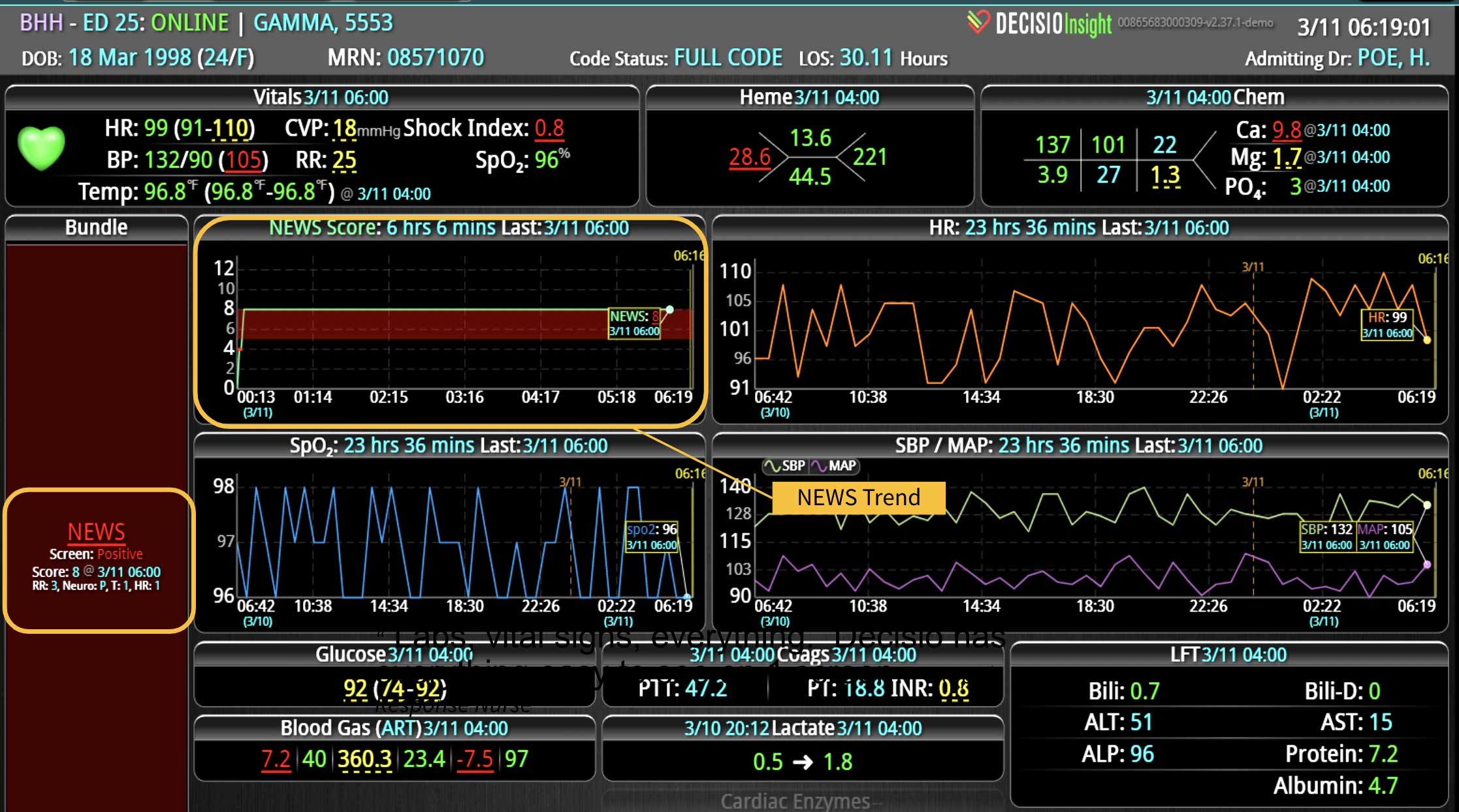
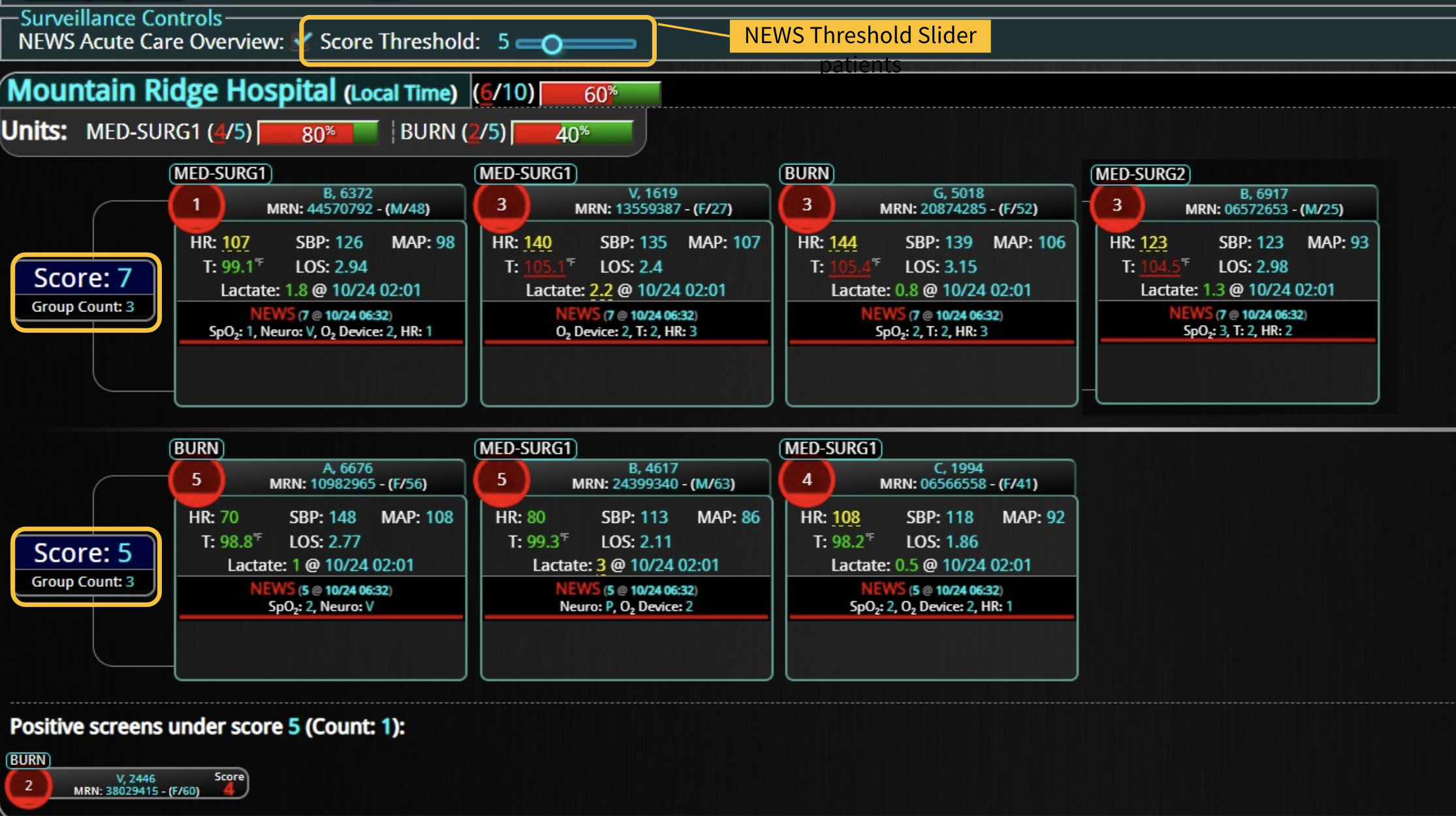
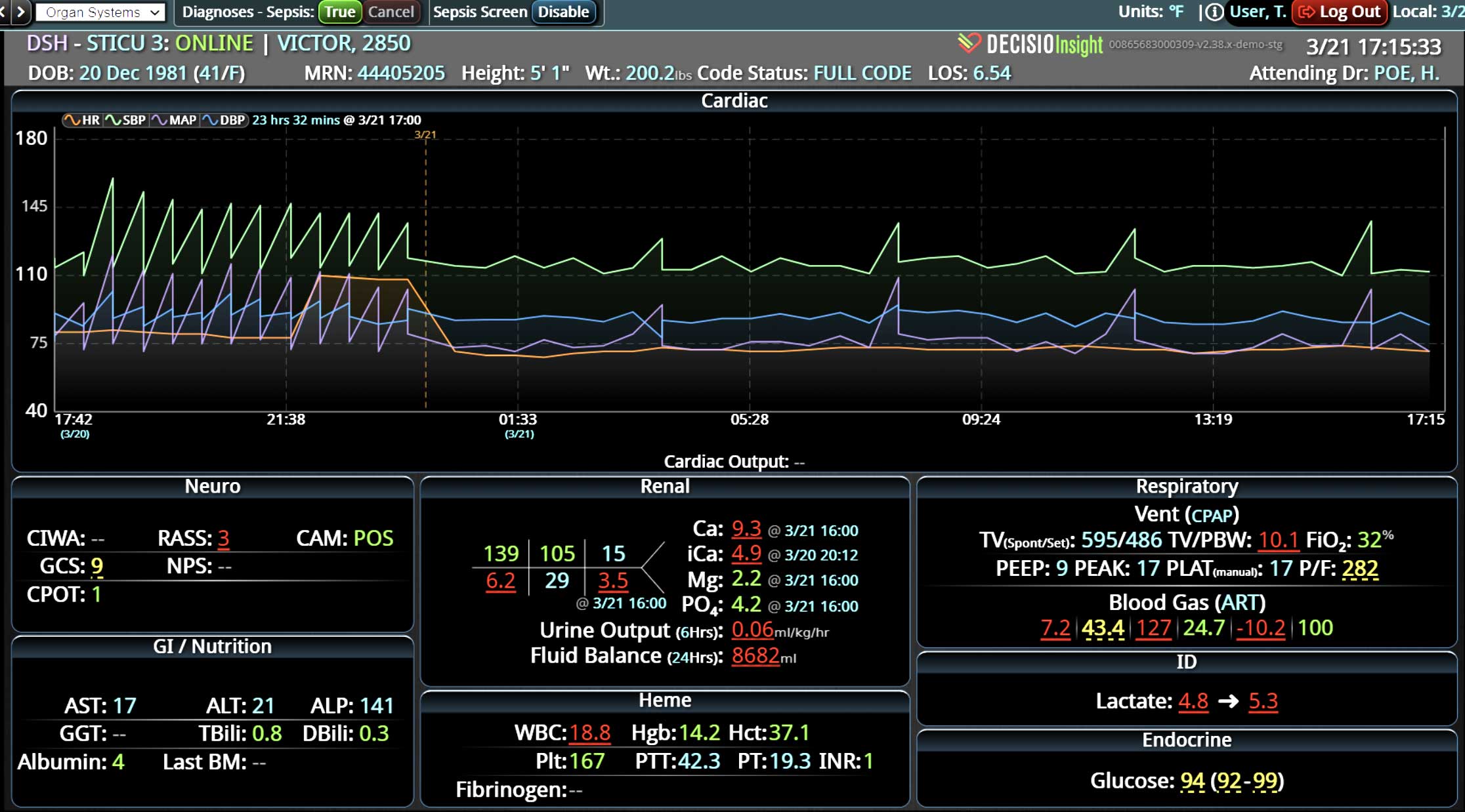
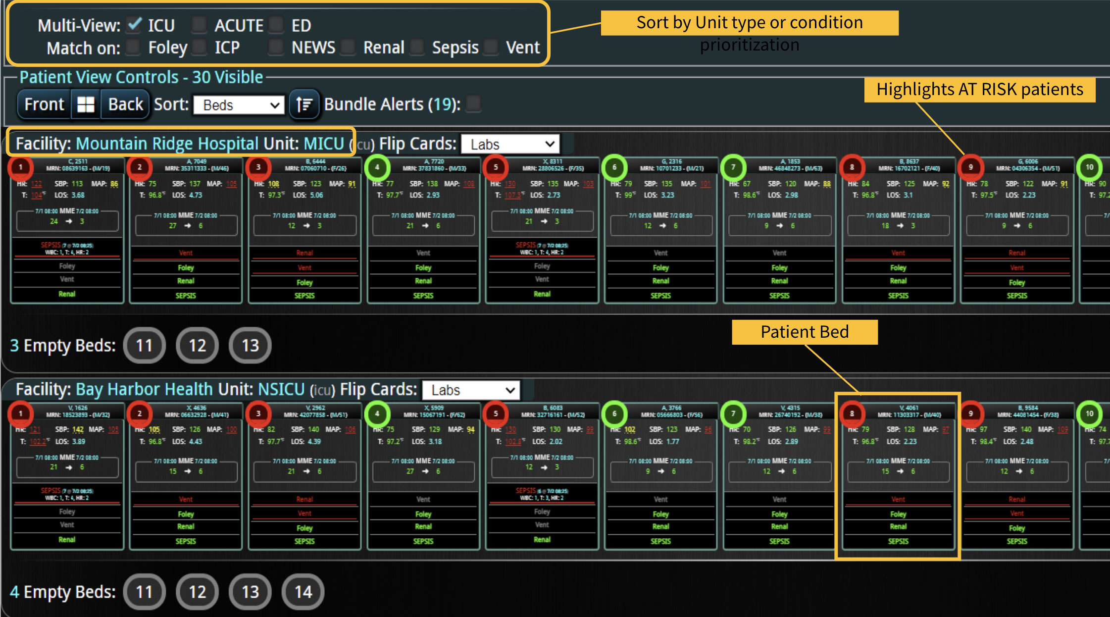
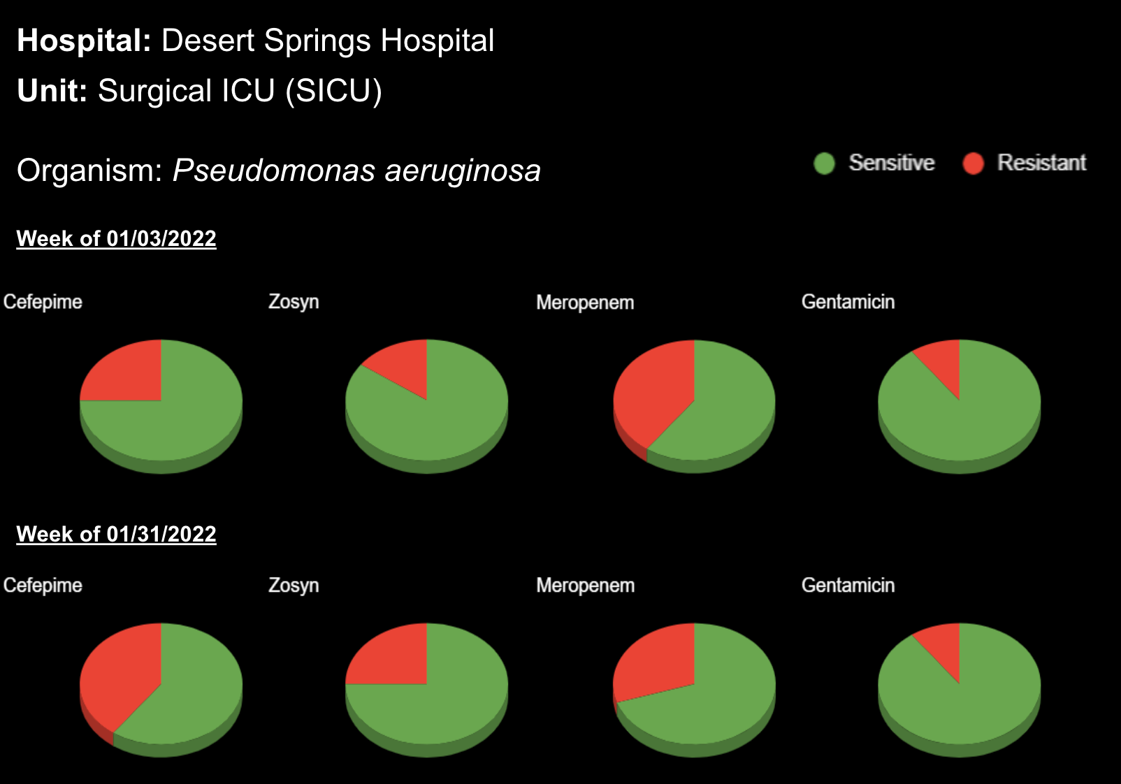
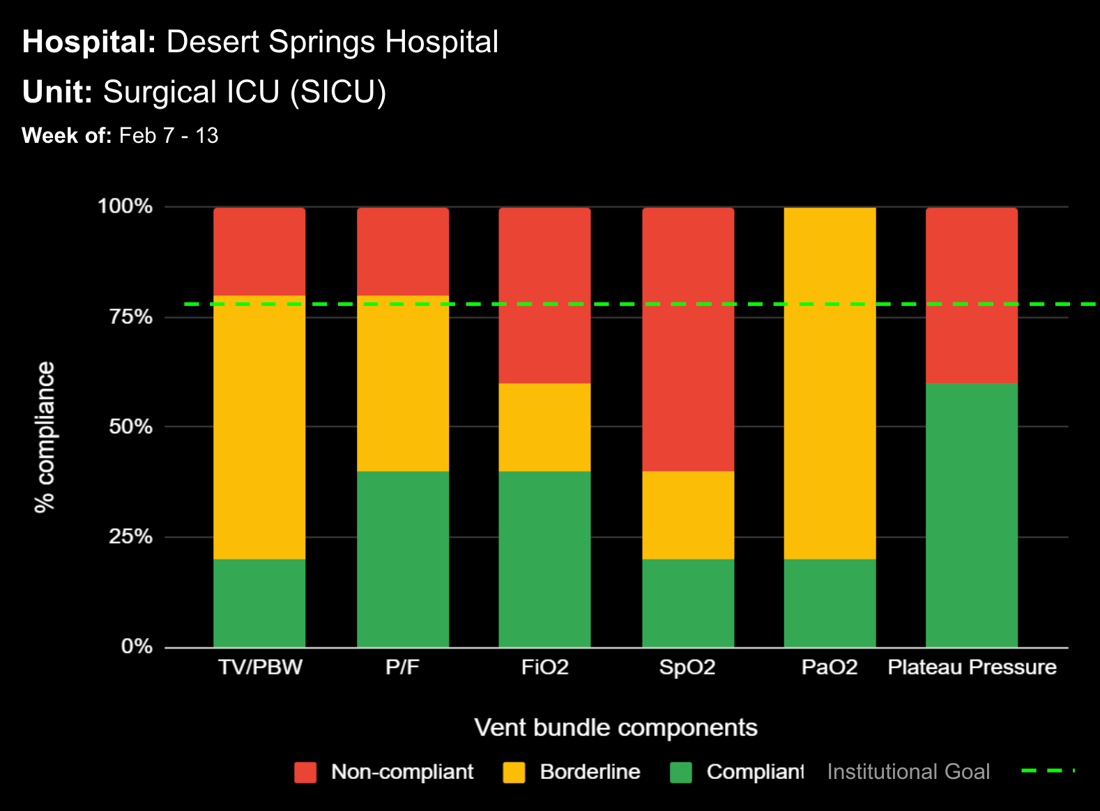
For example, a good visualization tool will sift through a patient’s EMR data to reveal a handful of “red” data-points to alert a clinician of abnormal results. However, a better data visualization tool will aggregate the patient’s data across numerous disparate sources, factor in his/her diagnoses, and instantly tell the very red story of a rapidly deteriorating patient.
Having a data visualization tool like this would allow a busy doc to quickly identify which red foe to tackle first (e.g. rising creatinine in a CKD patient on gentamicin). Similarly, a Mandrill may consider a pale-faced opponent unworthy of immediate action. But that same Mandrill will rapidly assess that a scarlet-faced adversary is worthy of a call for back-up…STAT.
Learn more About How we help clinicians improve patient outcomes
Schedule a call with our team to discuss how we are helping our clients revolutionize how clinicians manage patient interventions.


